R/Shiny web application for the World Health Organization
Visualizing Global Health Inequalities


The project
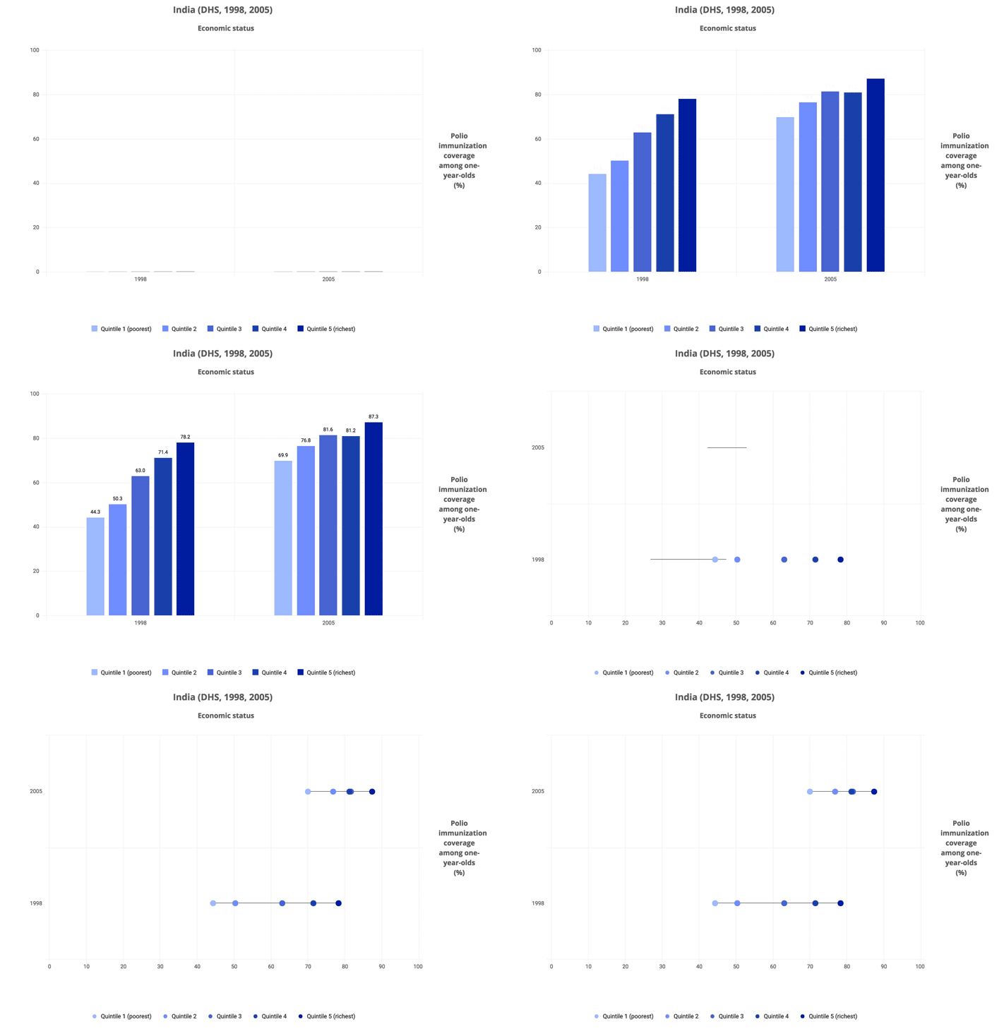
We worked with the World Health Organization to develop an interactive application using R/Shiny to assess and visualize data on global health inequalities. The finished application allows users to explore health inequality within countries and to compare disparities between countries using interactive tables and charts. It is used by WHO in workshops throughout the world.
Details on the tool and development can be found on the World Health Organization website.
The online version of the tool can be found here.
Our role
We wrote the application including both the front-end (and data visualization) and the backend responsible for calculations and data processing.
The application, known as the Health Equity Assessment Toolkit, consists of four R packages — two that generate R/Shiny applications and two data-focused pacakges including one that generates statistical measures of inequality.
Features of the work
- The software can compute a suite of complex statistical measures of inequality on the fly
- The software has been highlighted in two peer-review journal articles
- Interactive maps and charts using highcharts.js were created
- The tool is designed to work online but also to work offline in settings with limited internet connectivity like developing countries (there is both a Windows and a Mac version of the offline tool)
Tools used

R

Shiny

Highcharts/Highmaps
Made for
