One of the most powerful aspects of the R plotting package ggplot2 is the ease with which you can create multi-panel plots. With a single function you can split a single plot into many related plots using facet_wrap() or facet_grid().
Although creating multi-panel plots with ggplot2 is easy, understanding the difference between methods and some details about the arguments will help you make more effective plots. This post is designed to provide guidance on the different methods and arguments for facetting in ggplot2.
- An example: year of appearance of Marvel characters
- Our first plot: number of character appearances by year
- Our first multi-panel plot: counts of appearance of “good” and “bad” characters with
facet_wrap() - Specify a grid of plots by row and column with
facet_grid() - Utilizing Color
- Useful arguments for
facet_wrap()andfacet_grid() - Additional arguments
- Summary
This post assumes a general understanding of ggplot2, if you need more details on the basics you can review our cheatsheet on ggplot2 on the topic.
An example: year of appearance of Marvel characters

In honor of the release of Captain Marvel and the much anticipated upcoming Avengers: Endgame we’re using the fun Marvel character dataset downloaded from Kaggle for our example.
We will take advantage of three variables:
- YEAR: year of first appearance for the character
- SEX: the sex of the character
- ALIGN: representing whether the character is good, bad or neutral
We will start by loading the data and applying some cleanup. In particular, we will remove records with missing values for our key variables, shorten the SEX variable and rename the SEX variable name to gender.
Since many of the characters are of limited importance to the franchise, we also filter to characters that have appeared at least 100 times.
library(ggplot2)
library(dplyr)

marvel <- readr::read_csv("marvel-wikia-data.csv")

marvel <- filter(marvel, SEX != "", ALIGN != "", Year != "") %>%
  filter(!is.na(APPEARANCES), APPEARANCES>100) %>%
  mutate(SEX = stringr::str_replace(SEX, "Characters", "")) %>%
  arrange(desc(APPEARANCES)) %>%
  rename(gender = SEX) %>%
  rename_all(tolower)
Our first plot: number of character appearances by year
Throughout the post we will generate counts of characters grouped by year and, in some cases, other grouping variables. For this initial plot we compute simple counts by year.
marvel_count <- count(marvel, year)
glimpse(marvel_count)
## Observations: 57
## Variables: 2
## $ year <dbl> 1939, 1940, 1941, 1943, 1944, 1947, 1948, 1949, 1950, 195...
## $ n    <int> 3, 5, 4, 1, 1, 1, 1, 3, 1, 1, 1, 1, 1, 7, 20, 36, 34, 21,...
First we will create this relatively simple, one-panel plot with lines and points on top.
ggplot(data = marvel_count, aes(year, n)) +
  geom_line(color = "steelblue",size = 1) +
  geom_point(color="steelblue") +
  labs(title = "New Marvel characters by year",
       subtitle = "(limited to characters with more than 100 appearances)",
       y = "Count of new characters", x = "")
Our first multi-panel plot: counts of appearance of “good” and “bad” characters with facet_wrap()
To create a multi-panel plot with one panel per “alignment” we first need counts by year by alignment which we do with this code:
marvel_count <- count(marvel, year, align)
glimpse(marvel_count)
## Observations: 114
## Variables: 3
## $ year  <dbl> 1939, 1939, 1940, 1940, 1941, 1941, 1943, 1944, 1947, 19...
## $ align <chr> "Good Characters", "Neutral Characters", "Bad Characters...
## $ n     <int> 2, 1, 1, 4, 1, 3, 1, 1, 1, 1, 3, 1, 1, 1, 1, 1, 1, 6, 4,...
By simply adding + facet_wrap(~ align) to the end of our plot from above we can create a multi-panel plot with one pane per “alignment”.
Think of facet_wrap() as a ribbon of plots that arranges panels into rows and columns and chooses a layout that best fits the number of panels.
ggplot(data = marvel_count, aes(year, n)) +
  geom_line(color = "steelblue", size = 1) +
  geom_point(color="steelblue") +
  labs(title = "New Marvel characters by alignment",
       subtitle = "(limited to characters with more than 100 appearances)",
       y = "Count of new characters", x = "") +
  facet_wrap(~ align)
This plot is more informative than the original. A large number of “bad” characters were introduced in 1963 (8) and 1964 (16) but far fewer in later years. Many “good” characters, on the other hand, were introduced in subsequent years.
Notice that facet_wrap() chose a 1-row layout as optimum for our three panels.
facet_wrap() with two variables
ggplot2 makes it easy to use facet_wrap() with two variables by simply stringing them together with a +. Although it’s easy, and we show an example here, we would generally choose facet_grid() to facet by more than one variable in order to give us more layout control.
Compute the counts for the plot so we have two variables to use in faceting:
marvel_count <- count(marvel, year, align, gender)
glimpse(marvel_count)
## Observations: 155
## Variables: 4
## $ year  <dbl> 1939, 1939, 1940, 1940, 1940, 1941, 1941, 1943, 1944, 19...
## $ align <chr> "Good Characters", "Neutral Characters", "Bad Characters...
## $ gender   <chr> "Male ", "Female ", "Male ", "Female ", "Male ", "Male "...
## $ n     <int> 2, 1, 1, 1, 3, 1, 3, 1, 1, 1, 1, 1, 2, 1, 1, 1, 1, 1, 1,...
Create the plot and use facet_wrap(~ align + gender) to facet with two variables:
ggplot(data = marvel_count, aes(year, n)) +
  geom_line(color = "steelblue", size = 1) +
  geom_point(color = "steelblue") +
  labs(title = "New Marvel characters by alignment & gender",
       subtitle = "(limited to characters with more than 100 appearances)",
       y = "Count of new characters", x = "") +
facet_wrap(~ align + gender) 
This plot shows the ribbon layout for subplots (just one plot after another, filling the first row and then moving on to the next) sorted by alignment then gender.
Note that with 8 panels ggplot2 opted for three rows and three columns.
A note on margins between text on the strip
The default space between the two labels in the strip tends to be a bit too large for me. To change this you can use the following addition to the code above (though, again, facet_grid() is probably more effective for this example):
ggplot(data = marvel_count, aes(year, n)) +
  geom_line(color = "steelblue", size = 1) +
  geom_point(color = "steelblue") +
  labs(title = "New Marvel characters by alignment & gender",
       subtitle = "(limited to characters with more than 100 appearances)",
       y = "Count of new characters", x = "") +
  facet_wrap(~ align + gender)  +
  theme(
    strip.text.x = element_text(margin = margin(2, 0, 2, 0))
  )
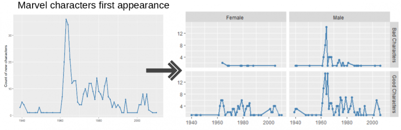
Specify a grid of plots by row and column with facet_grid()
Rather than allowing facet_wrap() to decide the layout of rows and columns you can use facet_grid() for organization and customization.
The syntax follows the pattern facet_grid(row_variable ~ column_variable) and we can apply that syntax to our plot from before with align as the row variable and gender as the column variable.
ggplot(data = marvel_count, aes(year, n)) +
  geom_line(color = "steelblue", size = 1) +
  geom_point(color = "steelblue") +
  labs(title = "New Marvel characters by alignment & gender",
       subtitle = "(limited to characters with more than 100 appearances)",
       y = "Count of new characters", x = "") +
facet_grid(align ~ gender) 
This grid layout makes the plots easier to read. It also clearly displays that there are more male marvel characters (for each alignment category) than all other genders.
Exclude a row or column variable in facet_grid()
If you want to exclude a row or column variable from facet_grid() you can replace it with a .. In this example we exclude the row variable:
ggplot(data = marvel_count, aes(year, n)) +
  geom_line(color = "steelblue", size = 1) +
  geom_point(color = "steelblue") +
  labs(title = "New Marvel characters by gender",
       subtitle = "(limited to characters with more than 100 appearances)",
       y = "Count of new characters", x = "") +
facet_grid(. ~ gender) 
And here we exclude the column variable:
ggplot(data = marvel_count, aes(year, n)) +
  geom_line(color = "steelblue", size = 1) +
  geom_point(color = "steelblue") +
  labs(title = "New Marvel characters by alignment",
       subtitle = "(limited to characters with more than 100 appearances)",
       y = "Count of new characters", x = "") +
facet_grid(align ~ .) 
Using color instead of faceting
In some cases color is more effective than faceting
In a time series like this it might be more effective to put the two lines on top of each other for easier comparison.
# Limit to male and female and change levels for drawing order
marvel_count <- filter(marvel_count, gender%in%c("Female ", "Male ")) %>%
  mutate(gender = factor(gender, levels = c("Male ", "Female ")))

ggplot(data = marvel_count, aes(year, n, color = gender)) +
  geom_line(size = 1) +
  geom_point() +
  labs(title = "New Marvel characters by gender",
       subtitle = "(limited to characters with more than 100 appearances)",
       y = "Count of new characters", x = "")
Combining color and faceting can also be effective
ggplot(data = marvel_count, aes(year, n, color = gender)) +
  geom_line(size = 1) +
  geom_point() +
  labs(title = "New Marvel characters by alignment & gender",
       subtitle = "(limited to characters with more than 100 appearances)",
       y = "Count of new characters", x = "")+
facet_grid(. ~ align) 
Useful arguments for facet_wrap() and facet_grid()
Many arguments work the same for both faceting functions, though there are a few differences.
nrow or ncol
- for
facet_wrap()only - controls the plot layout (by indicating the number of rows or columns)
- defaults to number of columns that fits page and then however many rows are needed
ggplot(data = marvel_count, aes(year, n)) +
  geom_line(color = "steelblue",size = 1) +
  geom_point(color = "steelblue") +
  facet_wrap(~ gender + align, nrow = 2) +
  labs(title = "New Marvel characters by gender & alignment",
       subtitle = "(using nrow=2)",
       y = "Count of new characters", x = "")
And here we assign the number of columns:
ggplot(data = marvel_count, aes(year, n)) +
  geom_line(color = "steelblue", size = 1) +
  geom_point(color ="steelblue") +
  facet_wrap(~ gender + align, ncol = 6) +
  labs(title = "New Marvel Characters by gender & alignment",
       subtitle = "(using ncol=6)",
       y = "Count of new characters", x = "") +
  theme(
       axis.text.x = element_text(angle=50, hjust=1)
  )
Note: I’ve tilted and adjusted the x axis tick text with ‘axis.text.x’ so no overlapping of labels occurs and that they align with the data nicely.
margins
- for
facet_gridonly - adds an additional facet for ALL when set to TRUE (default is FALSE)
marvel_count <-
   mutate(marvel_count, align = stringr::str_replace(align, "Characters", ""))

ggplot(data = marvel_count, aes(year, n)) +
  geom_line(color = "steelblue", size = 1) +
  geom_point(color = "steelblue") +
  labs(title = "New Marvel characters by alignment & gender",
       subtitle = "(margins= TRUE)",
       y = "Count of new characters", x = "") +
facet_grid(align ~ gender, margins=TRUE) 
Note: I’ve shortened the align values using str_replace, so that it displays better within the given space.
Notice the additional (all) facets are added for both rows and columns.
Using drop
By default facet_wrap() will drop facets with no data. As an example, if we tally new characteres by decade by gender there are no “genderfluid” characters in the 1930s. As a result facet_wrap() will drop this panel:
# Get counts by decade
marvel_count <- marvel %>%
   mutate(decade = as.integer(paste0(substring(year, 1, 3), 0)))
marvel_count <- count(marvel_count, decade, gender)
ggplot(data = marvel_count, aes("", n)) +
geom_bar(stat = "identity", width = 0.25, fill = "Steelblue") +
facet_wrap(decade ~ gender) +
labs(title = "New Marvel characters by decade & gender",
subtitle = "Note there are missing panels (e.g., 1930 Genderfluid)",
y = "Count of Marvel new characters", x = "")
But if you want all the facets, even those with no data, to appear use drop = FALSE. Notice below that “Genderfluid” now appears for 1930.
ggplot(data = marvel_count, aes("", n)) +
  geom_bar(stat="identity", width = 0.25, fill = "steelblue") +
  facet_wrap(decade ~ gender, drop = FALSE) +
  labs(title = "New Marvel Characters by decade & gender",
       subtitle = "No missing panels (e.g., 1930 Genderfluid panel is included)",
       y = "Count of new Marvel characters", x = "") +
  theme(
    strip.text.x = element_text(margin = margin(0, 0, 0, 0))
) 
note: I’ve used the strip.text argument to save vertical space for these plots.
Effective use of axis scales in facetting
Axes between panels can be shared (“fixed”) or they can vary (“free”) and changing between them can change plot interpretation dramatically.
Here is an example of scales using the default (fixed) axes (there is no scales argument in the code below since we are using the default).
marvel_count <- filter(marvel, gender%in%c("Female ", "Male "))
marvel_count <- count(marvel_count, year, gender)
ggplot(marvel_count, aes(year, n)) +
geom_line(color = "steelblue", size = 1) +
facet_wrap(~gender)+
labs(y= "Count of new Marvel characaters", x = "")
It’s very clear that there are more male characters but it’s not clear what years more female characters were added. This can be seen better in the next plot.
Our example is showing the scales argument using facet_wrap() but it also works for facet_grid.
This example gives the Y-axis the freedom to vary
You can allow both axes to vary with scales = "free" or free up the x- or y-scales individually with scales = "free_x" or “free_y”.
Careful though, the user may not notice the different scales and this can lead to misinterpretation. Use scales = "free" with care! The different y-axes in the plot below make it easy to tell that the most female characters were added in 1964 BUT if the reader doesn’t notice the different scales it will look like there are the same number of male and female characters.
ggplot(marvel_count, aes(year, n)) +
  geom_line(color = "steelblue", size = 1) +
  facet_wrap(~gender scales = "free_y")+
  labs(title = 'with "free" y axes' ,
       y = "Count of new Marvel characters")
space
- for
facet_grid()only - controls the height and/or width of the plot panels
- default is “fixed”, all panels have the same size
- set to “free”, “free_y” or “free_x” to adjust the panels size proportional to the scale of the axis.
- must be used in conjunction with the
scalesargument set to vary (“free”).
marvel_count <- filter(marvel, gender%in%c("Female ", "Male ")) %>%
  mutate(align = stringr::str_replace(align, "Characters", ""))
marvel_count <- count(marvel_count, year, gender, align)

ggplot(data = marvel_count, aes(year, n)) +
  geom_line(color = "steelblue", size = 1) +
  geom_point(color = "steelblue") +
  labs(title = "New Marvel characters by alignment & gender",
       subtitle = '(space = "free")',
       y = "Count of new characters", x = "") +
facet_grid(align ~ gender, space="free", scales="free") 
Notice that the panel’s height and width vary proportionally for the data that is displayed.
Additional arguments
dir
- contols direction of the subplots plots layout
- “h” for horizontal (default) or “v” for vertical
facet_wrap()only
marvel_count <- filter(marvel, gender%in%c("Female ", "Male "))
marvel_count <- count(marvel_count, year, gender)

ggplot(marvel_count, aes(year, n)) +
  geom_line(color = "steelblue", size = 1) +
  facet_wrap(~gender,  dir = "v") +
  labs(title = 'dir = "v"',
       y = "Count of new Marvel characters")
strip.position
- controls the facet subset labels
- options are “top” (default), “bottom”, “left” or “right”
facet_wrap()only
ggplot(marvel_count, aes(year, n)) +
  geom_line(color = "steelblue", size = 1) +
  facet_wrap(~gender, strip.position = "right") +
  labs(title = 'strip.postition = "right"',
       y = "Count of new Marvel characters")
switch
- controls the facet subset labels (similar to strip.position)
- defaults are top and right
- options are “x” top labels on bottom, “y” right labels on left or “both” labels on bottom and left
facet_grid()only
ggplot(marvel_count, aes(year, n)) +
  geom_line(color = "Steelblue", size = 1) +
  facet_grid(~gender, switch = "x"  ) +
  labs(title = 'switch = "x"',
       y = "Count of new Marvel characters")

Summary
Making multi-panel plots is easy with ggplot2’s powerful facetting functions. A single function can transform a hard-to-understand one-panel plot into a clearer set of multip-panel plots. facet_wrap() and facet_grid() have subtle differences and understanding how they operate can help you create more effective visualizations.
Happy plotting!
This has been so helpful!! Thank you!
Fantastic! Thank you so much
Thanks a lot!
This has been great! I consistently refer to it. Thanks!
This is a great tutorial, thank you! I was wondering, is there a way to put a vertical line (or horizontal if you have the plots stacked) in between each plot to distinguish them? I always use theme_minimal() for the clean look but it also makes the plots harder to distinguish on a white background.
Great information! THANKS!!!
I read this piece of writing completely regarding the difference of newest and earlier technologies,
it’s amazing article.
Hi to every single one, it’s truly a pleasant for me to
pay a visit this site, it consists of priceless Information.